Incidence per Capita
Introduction
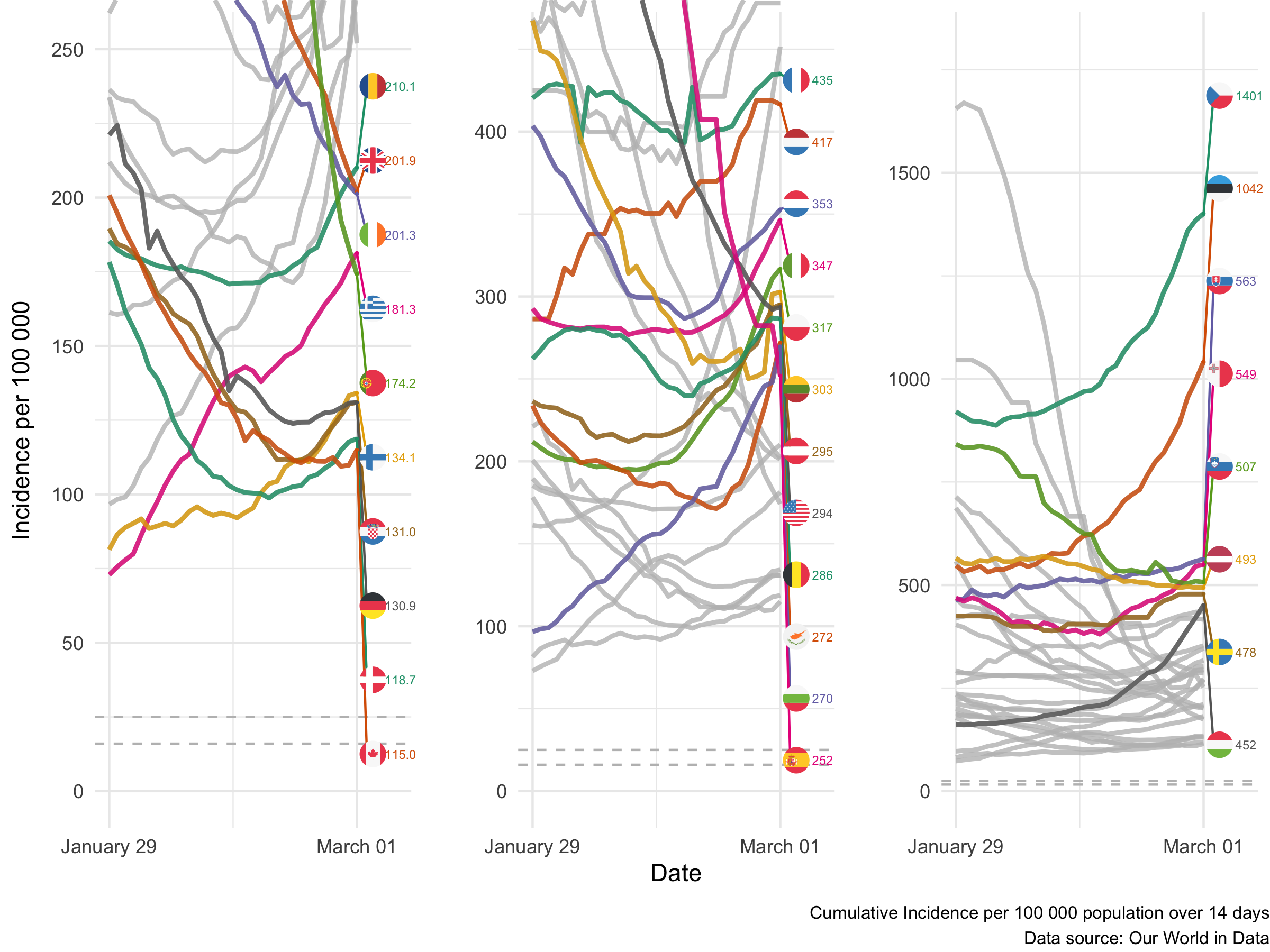
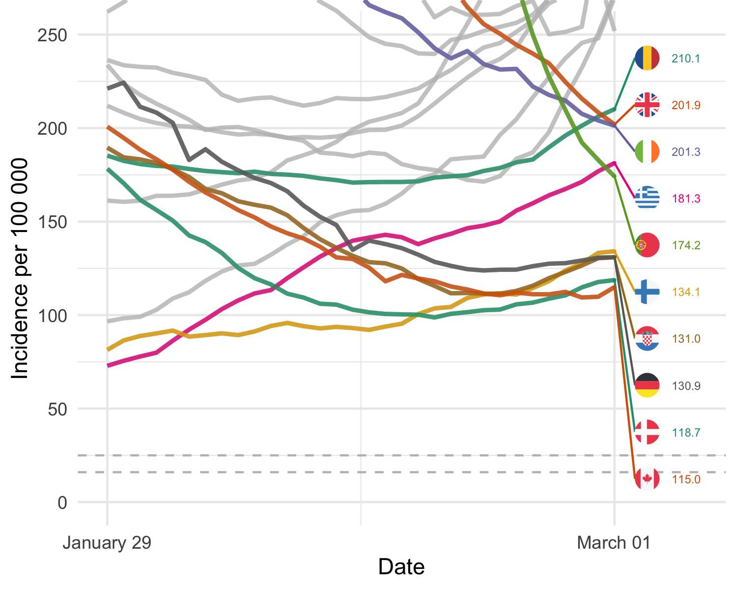
These graphs show the average incidence of COVID-19 in EU member states, the UK, Canada and the United States, based on data made available by the ECDC.
Horizontal lines indicate cuts offs of 16 and 25 cases per 100,000, which have been significant for decisions taken to close borders to travel or to require periods of quarantine for travellers arriving from these countries. Two lines are drawn reflecting cut-offs for border policy measures for some EU Member States.
This shows three parallel graphs over the same data over the same time frame. It uses three different scales (from 0 to 250, from 0 to 450, and from 0 to 1800) and highlights the curves which end in each frame. Dots indicate the values published by the ECDC on a weekly basis for these figures. The variance may be due to delays in reporting data or varying timelines for release and publication of data.
Background
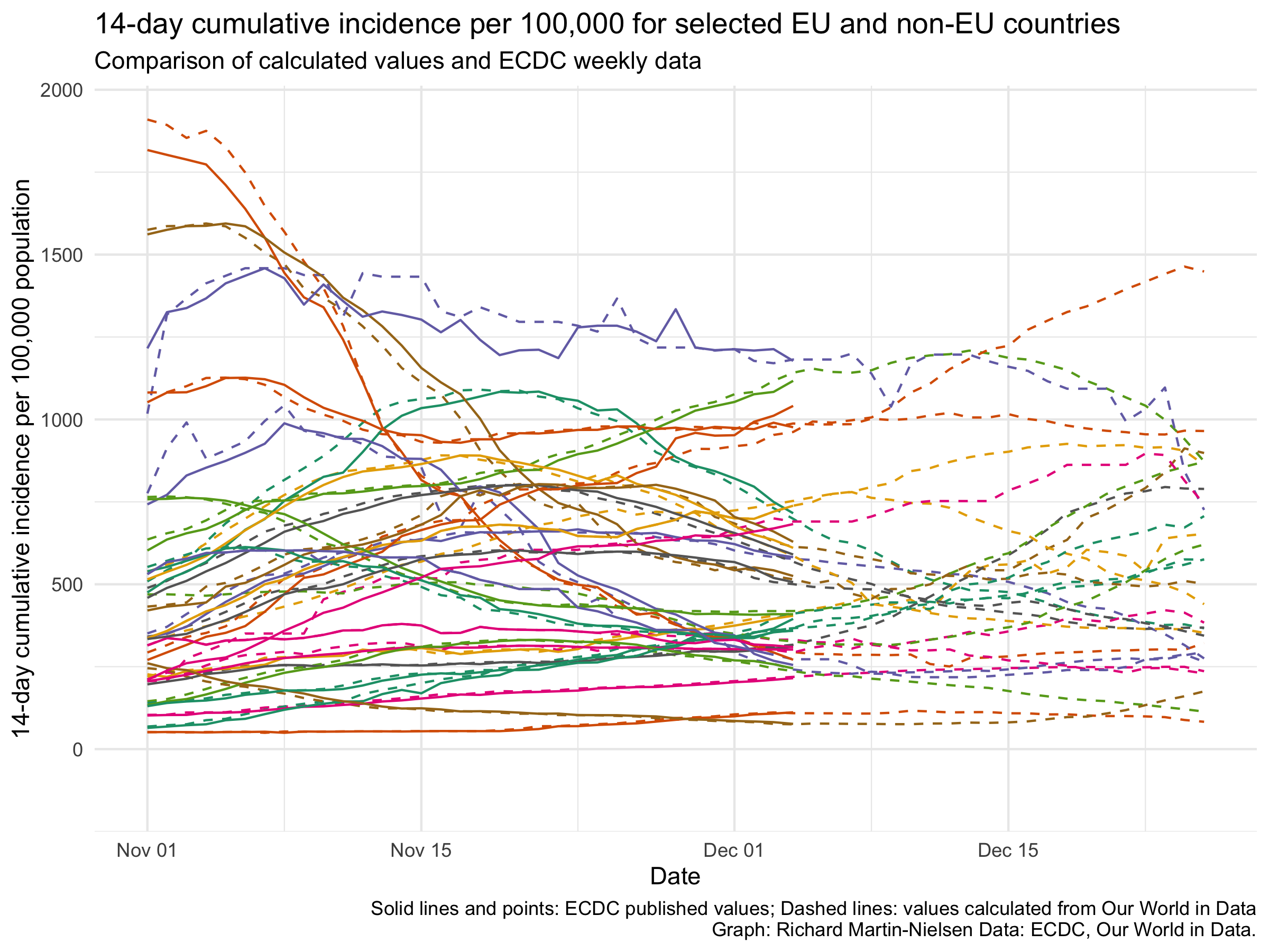
Until 23 December these graphs used ECDC calculated 14 day cumulative average incidences. These are now being calculated based on data from Our World in Data, downloaded using the sars2pack package.
Comparison with earlier data
Until 17 December the ECDC published daily calculations of the 14-day cumulative per capita incidence. They then switched to weekly data. I am now calculating the same figure based on data from Our World in Data. Below I compare my calculations (in a lighter shade) and their published data up until 4 December and their weekly data (in a solid shade and with dots). 4 December is the last date for which I have a saved version of their earlier form of the data
There is some discrepancy in some places, but this may be due to revisions in reported data. For some countries it is clear that there is a lag of a day or two between cases reported in one set of data or the other, likely due to different cut off times for the two and to differing schedules for release of data on a national basis.
Copyright © 2021 Richard Martin-Nielsen.